Back to Courses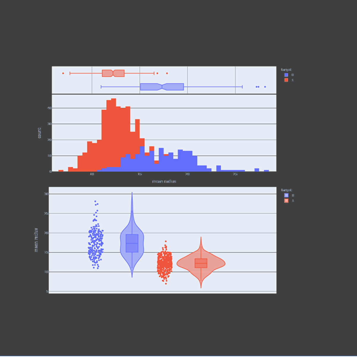






Probability And Statistics Courses - Page 11
Showing results 101-110 of 133

Interactive Statistical Data Visualization 101
In this guided project, we will explore plotly express to visualize statistical plots such as box plots, histograms, heatmaps, density maps, contour plots, and violin plots. Plotly express is a super powerful Python package that empowers anyone to create, manipulate and render graphical figures. This crash course is super practical and directly applicable to many industries such as banking, finance and tech industries.
Note: This course works best for learners who are based in the North America region. We’re currently working on providing the same experience in other regions.

Random Models, Nested and Split-plot Designs
Many experiments involve factors whose levels are chosen at random. A well-know situation is the study of measurement systems to determine their capability. This course presents the design and analysis of these types of experiments, including modern methods for estimating the components of variability in these systems. The course also covers experiments with nested factors, and experiments with hard-to-change factors that require split-plot designs. We also provide an overview of designs for experiments with response distributions from nonnormal response distributions and experiments with covariates.

Inferential Statistics
This course covers commonly used statistical inference methods for numerical and categorical data. You will learn how to set up and perform hypothesis tests, interpret p-values, and report the results of your analysis in a way that is interpretable for clients or the public. Using numerous data examples, you will learn to report estimates of quantities in a way that expresses the uncertainty of the quantity of interest. You will be guided through installing and using R and RStudio (free statistical software), and will use this software for lab exercises and a final project. The course introduces practical tools for performing data analysis and explores the fundamental concepts necessary to interpret and report results for both categorical and numerical data

Classify Images of Clouds in the Cloud with AutoML Vision
This is a self-paced lab that takes place in the Google Cloud console. AutoML Vision helps developers with limited ML expertise train high-quality image recognition models. In this hands-on lab, you will learn how to train a custom model to recognize different types of clouds (cumulus, cumulonimbus, etc.).

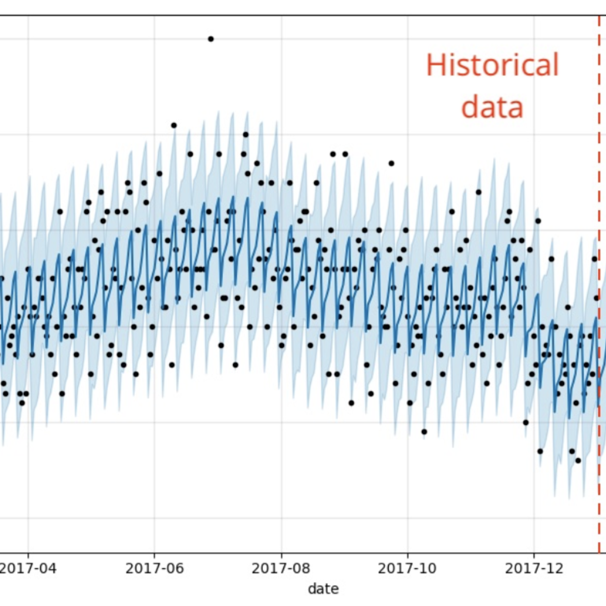
Intro to Time Series Analysis in R
In this 2 hour long project-based course, you will learn the basics of time series analysis in R. By the end of this project, you will understand the essential theory for time series analysis and have built each of the major model types (Autoregressive, Moving Average, ARMA, ARIMA, and decomposition) on a real world data set to forecast the future. We will go over the essential packages and functions in R as well to make time series analysis easy.

Information Theory
The lectures of this course are based on the first 11 chapters of Prof. Raymond Yeung’s textbook entitled Information Theory and Network Coding (Springer 2008). This book and its predecessor, A First Course in Information Theory (Kluwer 2002, essentially the first edition of the 2008 book), have been adopted by over 60 universities around the world as either a textbook or reference text.
At the completion of this course, the student should be able to:
1) Demonstrate knowledge and understanding of the fundamentals of information theory.
2) Appreciate the notion of fundamental limits in communication systems and more generally all systems.
3) Develop deeper understanding of communication systems.
4) Apply the concepts of information theory to various disciplines in information science.

Introduction to Probability and Data with R
This course introduces you to sampling and exploring data, as well as basic probability theory and Bayes' rule. You will examine various types of sampling methods, and discuss how such methods can impact the scope of inference. A variety of exploratory data analysis techniques will be covered, including numeric summary statistics and basic data visualization. You will be guided through installing and using R and RStudio (free statistical software), and will use this software for lab exercises and a final project. The concepts and techniques in this course will serve as building blocks for the inference and modeling courses in the Specialization.

Understanding Clinical Research: Behind the Statistics
If you’ve ever skipped over`the results section of a medical paper because terms like “confidence interval” or “p-value” go over your head, then you’re in the right place. You may be a clinical practitioner reading research articles to keep up-to-date with developments in your field or a medical student wondering how to approach your own research. Greater confidence in understanding statistical analysis and the results can benefit both working professionals and those undertaking research themselves.
If you are simply interested in properly understanding the published literature or if you are embarking on conducting your own research, this course is your first step. It offers an easy entry into interpreting common statistical concepts without getting into nitty-gritty mathematical formulae. To be able to interpret and understand these concepts is the best way to start your journey into the world of clinical literature. That’s where this course comes in - so let’s get started!
The course is free to enroll and take. You will be offered the option of purchasing a certificate of completion which you become eligible for, if you successfully complete the course requirements. This can be an excellent way of staying motivated! Financial Aid is also available.

Visualizing Data in the Tidyverse
Data visualization is a critical part of any data science project. Once data have been imported and wrangled into place, visualizing your data can help you get a handle on what’s going on in the data set. Similarly, once you’ve completed your analysis and are ready to present your findings, data visualizations are a highly effective way to communicate your results to others. In this course we will cover what data visualization is and define some of the basic types of data visualizations.
In this course you will learn about the ggplot2 R package, a powerful set of tools for making stunning data graphics that has become the industry standard. You will learn about different types of plots, how to construct effect plots, and what makes for a successful or unsuccessful visualization.
In this specialization we assume familiarity with the R programming language. If you are not yet familiar with R, we suggest you first complete R Programming before returning to complete this course.

Avoiding Data Science Pitfalls
In this 2-hour long project-based course, you will learn some important statistical concepts with examples & visuals, concepts that are most commonly mistaken in data analysis and how to ensure you don’t fall for them.
Popular Internships and Jobs by Categories
Find Jobs & Internships
Browse
© 2024 BoostGrad | All rights reserved