Back to Courses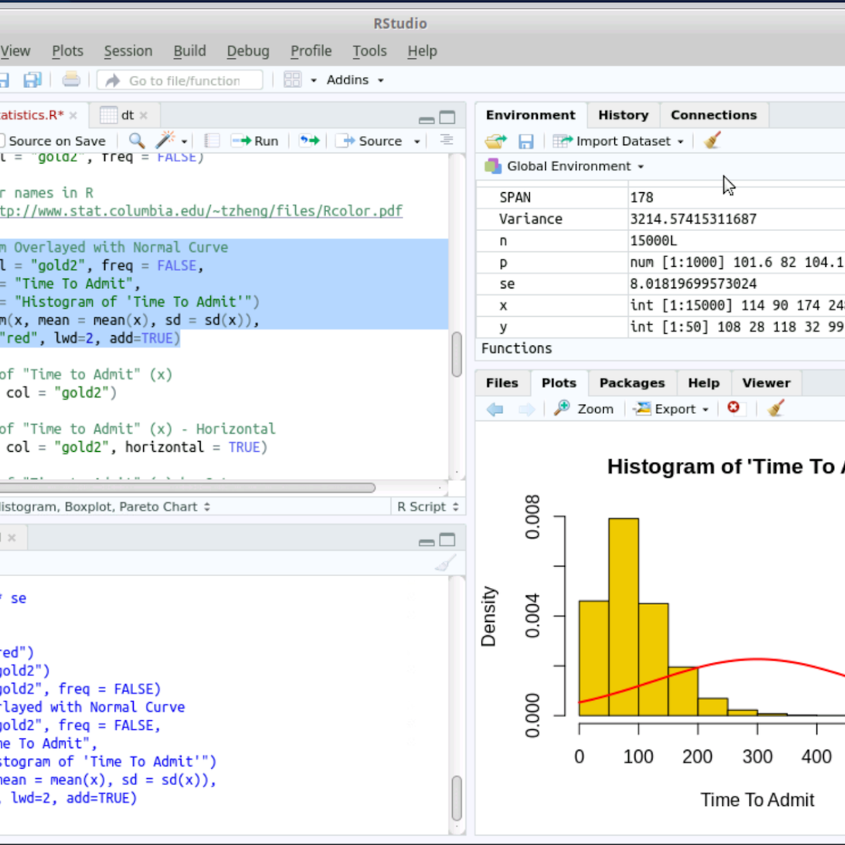


Data Analysis Courses - Page 57
Showing results 561-570 of 998
RStudio for Six Sigma - Basic Descriptive Statistics
Welcome to RStudio for Six Sigma - Basic Description Statistics. This is a project-based course which should take approximately 2 hours to finish. Before diving into the project, please take a look at the course objectives and structure.
By the end of this project, you will learn to perform Basic Descriptive Analysis (Six Sigma) tasks hands-on using RStudio. Both R language and RStudio tools are Open Source and can be used for most Six Sigma analysis tasks without needing commercial software.
Measurement Systems Analysis
In this course, you will learn to analyze measurement systems for process stability and capability and why having a stable measurement process is imperative prior to performing any statistical analysis. You will analyze continuous measurement systems and statistically characterize both accuracy and precision using R software. You will perform measurement systems analysis for potential, short-term and long-term statistical control and capability. Additionally, you will learn how to assess a discrete measurement and perform analyses for internal consistency, concordance between assessors, and concordance with a standard. Finally, you will learn how to make decisions on measurement systems process improvement.
This specialization can be taken for academic credit as part of CU Boulder’s Master of Science in Data Science (MS-DS) degree offered on the Coursera platform. The MS-DS is an interdisciplinary degree that brings together faculty from CU Boulder’s departments of Applied Mathematics, Computer Science, Information Science, and others. With performance-based admissions and no application process, the MS-DS is ideal for individuals with a broad range of undergraduate education and/or professional experience in computer science, information science, mathematics, and statistics. Learn more about the MS-DS program at https://www.coursera.org/degrees/master-of-science-data-science-boulder.
Hyperparameter Tuning with Keras Tuner
In this 2-hour long guided project, we will use Keras Tuner to find optimal hyperparamters for a Keras model. Keras Tuner is an open source package for Keras which can help machine learning practitioners automate Hyperparameter tuning tasks for their Keras models. The concepts learned in this project will apply across a variety of model architectures and problem scenarios. Please note that we are going to learn to use Keras Tuner for hyperparameter tuning, and are not going to implement the tuning algorithms ourselves. At the time of recording this project, Keras Tuner has a few tuning algorithms including Random Search, Bayesian Optimization and HyperBand.
In order to complete this project successfully, you will need prior programming experience in Python. This is a practical, hands on guided project for learners who already have theoretical understanding of Neural Networks, and optimization algorithms like gradient descent but want to understand how to use Keras Tuner to start optimizing hyperparameters for training their Keras models. You should also be familiar with the Keras API.
Note: This course works best for learners who are based in the North America region. We’re currently working on providing the same experience in other regions.
Computational Social Science Methods
This course gives you an overview of the current opportunities and the omnipresent reach of computational social science. The results are all around us, every day, reaching from the services provided by the world’s most valuable companies, over the hidden influence of governmental agencies, to the power of social and political movements. All of them study human behavior in order to shape it. In short, all of them do social science by computational means.
In this course we answer three questions:
I. Why Computational Social Science (CSS) now?
II. What does CSS cover?
III. What are examples of CSS?
In this last part, we take a bird’s-eye view on four main applications of CSS. First, Prof. Blumenstock from UC Berkeley discusses how we can gain insights by studying the massive digital footprint left behind today’s social interactions, especially to foster international development. Second, Prof. Shelton from UC Riverside introduces us to the world of machine learning, including the basic concepts behind this current driver of much of today's computational landscape. Prof. Fowler, from UC San Diego introduces us to the power of social networks, and finally, Prof. Smaldino, from UC Merced, explains how computer simulation help us to untangle some of the mysteries of social emergence.
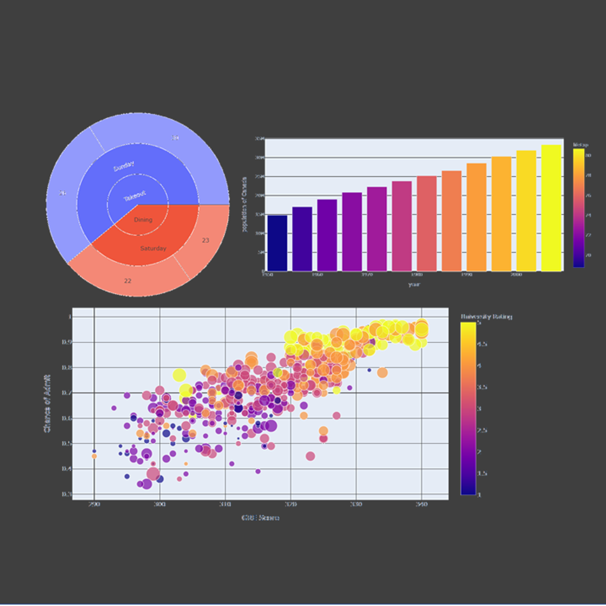
Crash Course on Interactive Data Visualization with Plotly
In this hands-on project, we will understand the fundamentals of interactive data visualization using Plolty Express. Plotly Express is a powerful Python package that empowers anyone to create, manipulate and render graphical figures with very few lines of code. Plotly Express is the recommended entry-point into the plotly package. We will leverage Plotly Express to generate interactive single Line plots, multiple line plots, histograms, pie charts, scatterplots, bubble charts, and bar charts.
Note: This course works best for learners who are based in the North America region. We’re currently working on providing the same experience in other regions.
Cloud Operations for GKE
This is a self-paced lab that takes place in the Google Cloud console. In this lab you will set up Monitoring and visualizing metrics from a Kubernetes Engine cluster
Scatter Plot for Data Scientists & Big Data Analysts-Visuals
This project gives you easy access to the invaluable learning techniques used by experts for visualization in statistics. We’ll learn about how to use wolfram language to draw curve in easiest way. We’ll also cover illustration and best practices shown by research to be most effective in helping you master plotting curves.
Using these approaches, no matter what your skill levels in topics you would like to master, you can change your thinking and change your life. If you’re already an expert, this peep under the mental hood will give you ideas for turbocharging successful learning, including counter-intuitive test-taking tips and insights that will help you make the best use of your time on homework and problem sets. If you’re struggling, you’ll see a structured treasure trove of practical techniques that walk you through what you need to do to get on track. If you’ve ever wanted to become better at anything, this project will help serve as your guide.
In this project we will take some illustrations and be able to Visualize the data by Scatter Plot using Wolfram Mathematica.
By the end of this project learners will:
Be able to plot basic examples (list of y values and x y pair)& several data items with legends (labeling each Plot and each data item)
Be able to plot values including 'units' and using individual 'color' for each point
Be able to plot the range where the data is non real are excluded & function ranges where it is selected automatically.
Analyze Text Data with Yellowbrick
Welcome to this project-based course on Analyzing Text Data with Yellowbrick. Tasks such as assessing document similarity, topic modelling and other text mining endeavors are predicated on the notion of "closeness" or "similarity" between documents. In this course, we define various distance metrics (e.g. Euclidean, Hamming, Cosine, Manhattan, etc) and understand their merits and shortcomings as they relate to document similarity. We will apply these metrics on documents within a specific corpus and visualize our results. By the end of this course, you will be able to confidently use visual diagnostic tools from Yellowbrick to steer your machine learning workflow, vectorize text data using TF-IDF, and cluster documents using embedding techniques and appropriate metrics.
This course runs on Coursera's hands-on project platform called Rhyme. On Rhyme, you do projects in a hands-on manner in your browser. You will get instant access to pre-configured cloud desktops containing all of the software and data you need for the project. Everything is already set up directly in your internet browser so you can just focus on learning. For this project, you’ll get instant access to a cloud desktop with Python, Jupyter, Yellowbrick, and scikit-learn pre-installed.
Notes:
- You will be able to access the cloud desktop 5 times. However, you will be able to access instructions videos as many times as you want.
- This course works best for learners who are based in the North America region. We’re currently working on providing the same experience in other regions.
Precalculus: Relations and Functions
This course helps to build the foundational material to use mathematics as a tool to model, understand, and interpret the world around us. This is done through studying functions, their properties, and applications to data analysis. Concepts of precalculus provide the set of tools for the beginning student to begin their scientific career, preparing them for future science and calculus courses. This course is designed for all students, not just those interested in further mathematics courses. Students interested in the natural sciences, computer sciences, psychology, sociology, or similar will genuinely benefit from this introductory course, applying the skills learned to their discipline to analyze and interpret their subject material. Students will be presented with not only new ideas, but also new applications of an old subject. Real-life data, exercise sets, and regular assessments help to motivate and reinforce the content in this course, leading to learning and mastery.
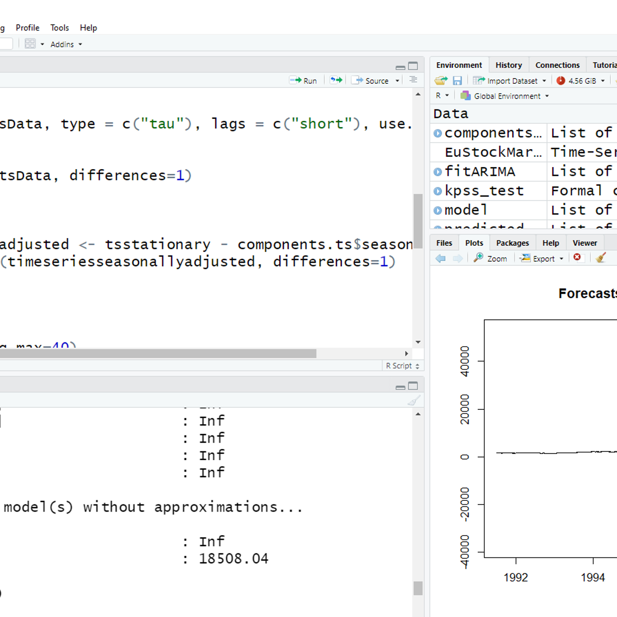
Time Series Analysis (ARIMA) with R
In this project, you will learn to conduct a thorough analysis of a time series data using ARIMA. The project explains the basic concepts of time series analysis and illustrates the same with hands-on activity on R Studio. It describes the types of time series data and its distinct components. The project covers how to conduct diagnostic tests to check for core assumptions of ARIMA, evaluating model process and orders from ACF, PACF graphs. Finally, it derives best fit model to forecast future values.
Popular Internships and Jobs by Categories
Find Jobs & Internships
Browse


© 2024 BoostGrad | All rights reserved