Back to Courses


Data Analysis Courses - Page 52
Showing results 511-520 of 998
Master the Art of Data Visualization With Tableau Public
Tableau is widely recognized as one of the premier data visualization software programs. For many years access to the program was limited to those who purchased licenses. Recently, Tableau launched a public version that grants the ability to create amazing data visualizations for free. Account members can also share and join projects to collaborate on projects that can change the world.
By the end of this project, we will learn how to create an account, create visualizations, and how to share visualizations with others.
Note: This course works best for learners who are based in the North America region. We’re currently working on providing the same experience in other regions.
Getting Started with Tidyverse
In this project, you will learn about Tidyverse, a system of packages for data manipulation, exploration and visualization in the R programming language. R is a computer programming language, and it is also an open-source software often used among data scientists, statisticians, and data miners in their everyday work with data sets.
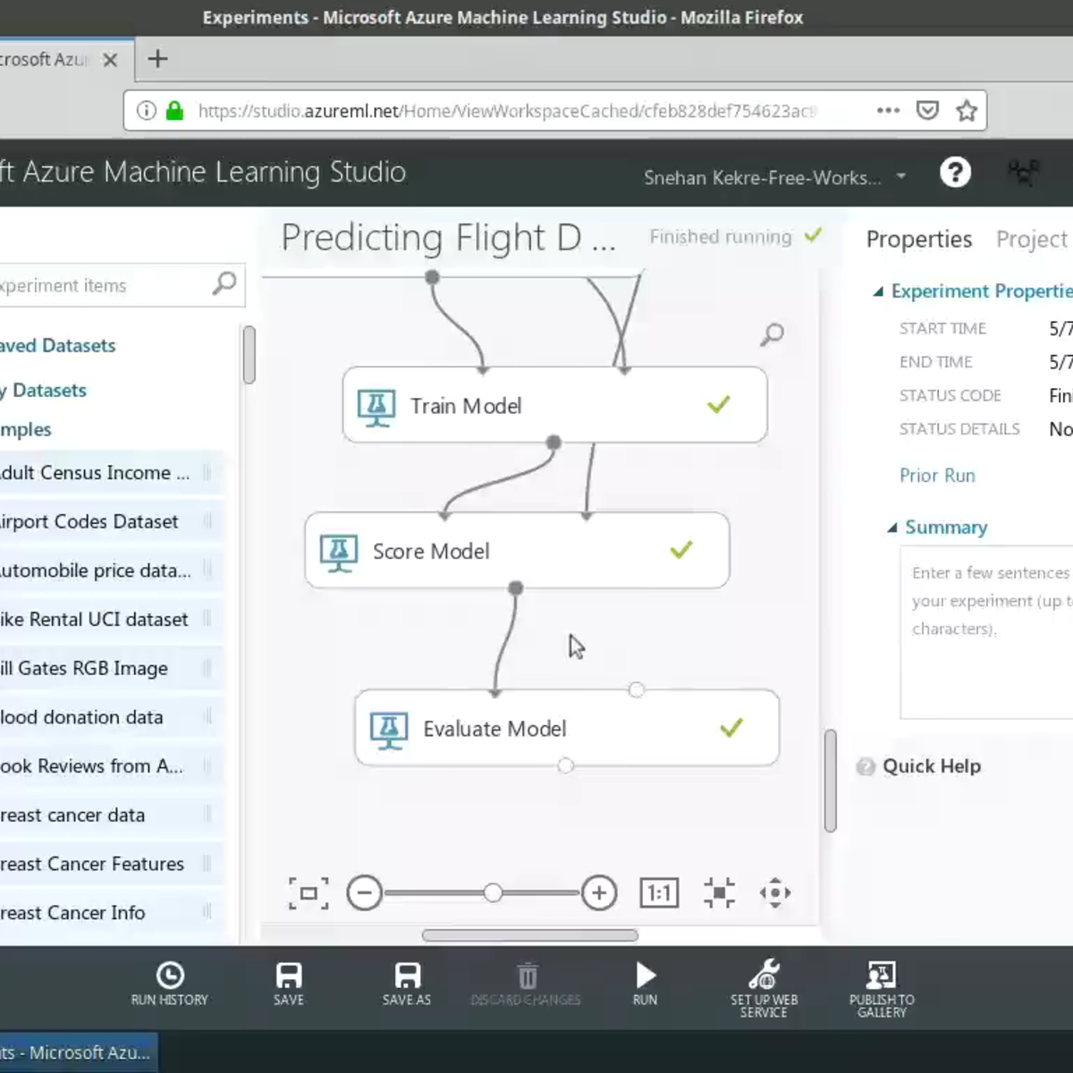
Predictive Modelling with Azure Machine Learning Studio
In this project, we will use Azure Machine Learning Studio to build a predictive model without writing a single line of code! Specifically, we will predict flight delays using weather data provided by the US Bureau of Transportation Statistics and the National Oceanic and Atmospheric Association (NOAA). You will be provided with instructions on how to set up your Azure Machine Learning account with $200 worth of free credit to get started with running your experiments!
This course runs on Coursera's hands-on project platform called Rhyme. On Rhyme, you do projects in a hands-on manner in your browser. You will get instant access to pre-configured cloud desktops containing all of the software and data you need for the project. Everything is already set up directly in your internet browser so you can just focus on learning. For this project, you’ll get instant access to a cloud desktop with Python, Jupyter, and scikit-learn pre-installed.
Notes:
- This course works best for learners who are based in the North America region. We’re currently working on providing the same experience in other regions.
Employee Attrition Prediction Using Machine Learning
In this project-based course, we will build, train and test a machine learning model to predict employee attrition using features such as employee job satisfaction, distance from work, compensation and performance. We will explore two machine learning algorithms, namely: (1) logistic regression classifier model and (2) Extreme Gradient Boosted Trees (XG-Boost). This project could be effectively applied in any Human Resources department to predict which employees are more likely to quit based on their features.
Note: This course works best for learners who are based in the North America region. We’re currently working on providing the same experience in other regions.
Process Data from Dirty to Clean
This is the fourth course in the Google Data Analytics Certificate. These courses will equip you with the skills needed to apply to introductory-level data analyst jobs. In this course, you’ll continue to build your understanding of data analytics and the concepts and tools that data analysts use in their work. You’ll learn how to check and clean your data using spreadsheets and SQL as well as how to verify and report your data cleaning results. Current Google data analysts will continue to instruct and provide you with hands-on ways to accomplish common data analyst tasks with the best tools and resources.
Learners who complete this certificate program will be equipped to apply for introductory-level jobs as data analysts. No previous experience is necessary.
By the end of this course, you will be able to do the following:
- Learn how to check for data integrity.
- Discover data cleaning techniques using spreadsheets.
- Develop basic SQL queries for use on databases.
- Apply basic SQL functions for cleaning and transforming data.
- Gain an understanding of how to verify the results of cleaning data.
- Explore the elements and importance of data cleaning reports.
Leveraging Unstructured Data with Cloud Dataproc on Google Cloud em Português Brasileiro
Este curso intensivo de uma semana baseia-se nos cursos anteriores da especialização Data Engineering on Google Cloud Platform. Por meio de videoaulas, demonstrações e laboratórios práticos, você aprenderá a criar e gerenciar clusters de computação para executar jobs do Hadoop, Spark, Pig e/ou Hive no Google Cloud Platform.Você também aprenderá a acessar várias opções de armazenamento em nuvem dos clusters de computação e integrar os recursos de machine learning do Google aos respectivos programas de análise.
Nos laboratórios práticos, você criará e gerenciará os clusters do Dataproc usando o console da Web e a CLI e usará o cluster para executar jobs do Spark e Pig. Depois você criará notebooks iPython que são integrados ao BigQuery e ao armazenamento e utilizará o Spark. Por fim, você integrará as APIs de machine learning à análise de dados.
Pré-requisitos
• Noções básicas de Big Data e Machine Learning do Google Cloud Platform (ou experiência equivalente)
• Algum conhecimento de Python
Introduction to the C# Type System
By the end of this project, you will use the C# Type System to represent data in a C# program.
The C# type system is used to represent data of various types such as decimal, integer, character, and string in an efficient manner.
Performing Network, Path, and Text Analyses in SAS Visual Analytics
In this course, you learn about the data structure needed for network, path, and text analytics and how to create network analysis, path analysis, and text analytics in SAS Visual Analytics.
Finding, Sorting, & Filtering Data in Microsoft Excel
In this project you will learn to use the searching, sorting, and filtering features of Microsoft Excel. Using the free version of Office 365’s Excel for the web, you will manipulate spreadsheet data to make it more useful for effective business decision-making. Using a filter, you’ll isolate just the data needed. You can then sort it into a logical sequence that can turn data into the information needed for effective decision making.
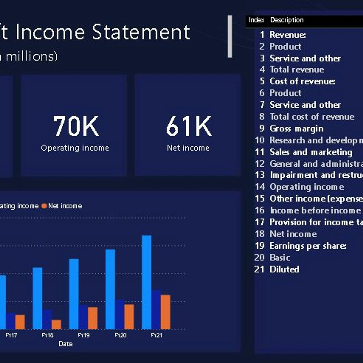
Build an Income Statement Dashboard in Power BI
In this 1.5 hours long project, we will be creating an income statement dashboard filled with relevant charts and data. Power BI dashboards are an amazing way to visualize data and make them interactive. We will begin this guided project by importing the data and transforming it in the Power Query editor. We will then visualize the Income Statement using a table, visualize total revenue, operating income and net income using cards and in the final task visualize the year on year growth using clustered column charts. This project is for anyone who is interested in Power BI and data visualization and specially for those who work in accounts and finance departments. By the end of this course, you will be confident in creating financial statement dashboards with many different kinds of visualizations.
Popular Internships and Jobs by Categories
Find Jobs & Internships
Browse


© 2024 BoostGrad | All rights reserved