Build an Income Statement Dashboard in Power BI
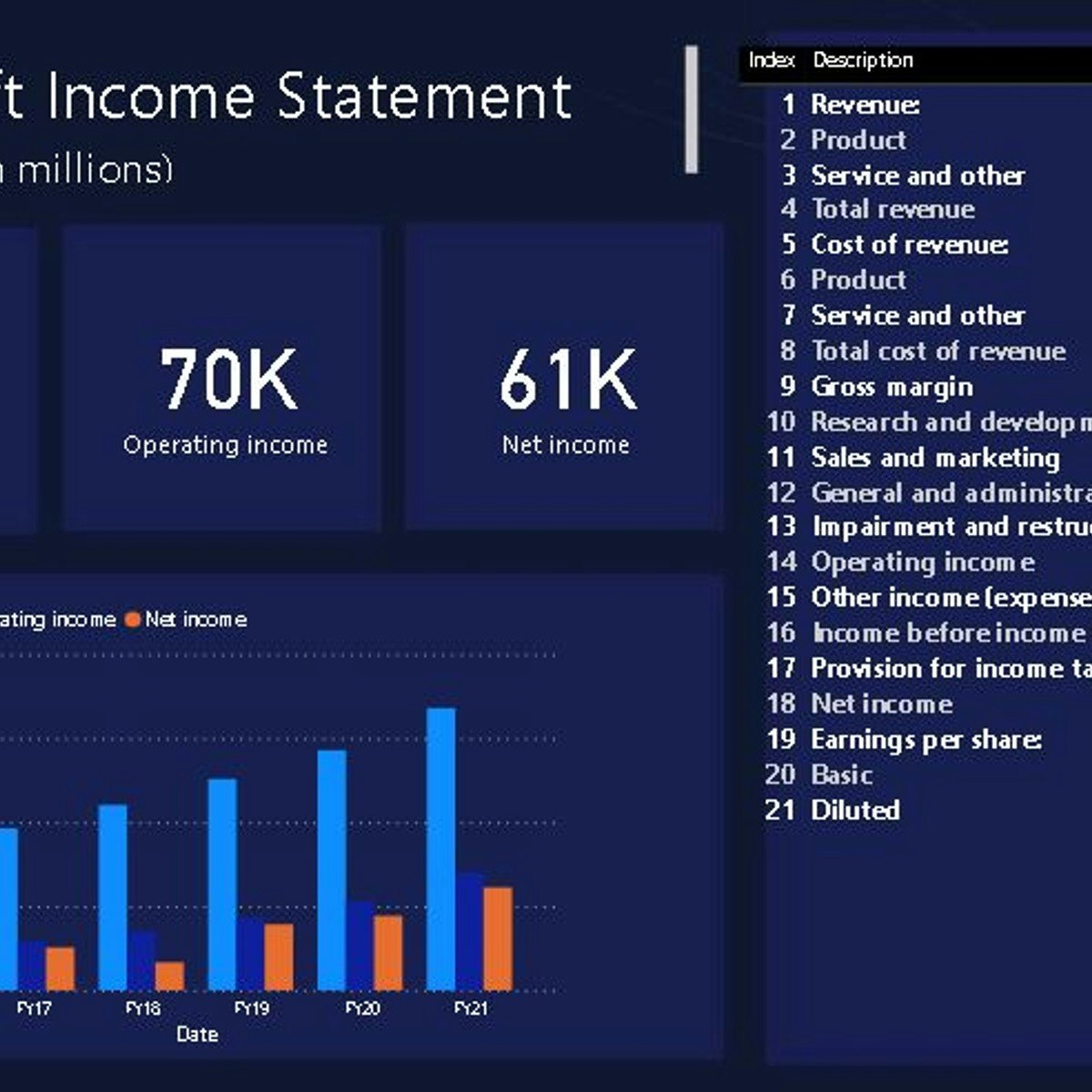
Overview
In this 1.5 hours long project, we will be creating an income statement dashboard filled with relevant charts and data. Power BI dashboards are an amazing way to visualize data and make them interactive. We will begin this guided project by importing the data and transforming it in the Power Query editor. We will then visualize the Income Statement using a table, visualize total revenue, operating income and net income using cards and in the final task visualize the year on year growth using clustered column charts. This project is for anyone who is interested in Power BI and data visualization and specially for those who work in accounts and finance departments. By the end of this course, you will be confident in creating financial statement dashboards with many different kinds of visualizations.

