Back to Courses


Data Science Courses - Page 84
Showing results 831-840 of 1407
Machine Learning Algorithms with R in Business Analytics
One of the most exciting aspects of business analytics is finding patterns in the data using machine learning algorithms. In this course you will gain a conceptual foundation for why machine learning algorithms are so important and how the resulting models from those algorithms are used to find actionable insight related to business problems. Some algorithms are used for predicting numeric outcomes, while others are used for predicting the classification of an outcome. Other algorithms are used for creating meaningful groups from a rich set of data. Upon completion of this course, you will be able to describe when each algorithm should be used. You will also be given the opportunity to use R and RStudio to run these algorithms and communicate the results using R notebooks.
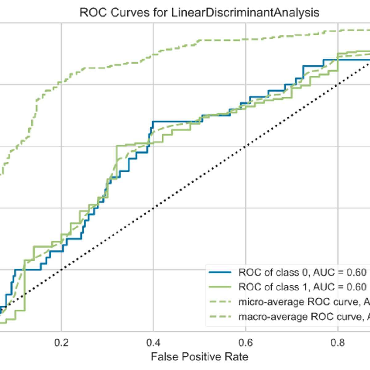
Build a Classification Model using PyCaret
In this 1-hour long project-based course, you will create an end-to-end classification model using PyCaret a low-code Python open-source Machine Learning library.
The goal is to build a model that can accurately predict whether a teacher's project proposal was accepted, based on the data they provided in their application.
You will learn how to automate the major steps for building, evaluating, comparing and interpreting Machine Learning Models for classification.
Here are the main steps you will go through: frame the problem, get and prepare the data, discover and visualize the data, create the transformation pipeline, build, evaluate, interpret and deploy the model.
This guided project is for seasoned Data Scientists who want to build a accelerate the efficiency in building POC and experiments by using a low-code library. It is also for Citizen data Scientists (professionals working with data) by using the low-code library PyCaret to add machine learning models to the analytics toolkit
In order to be successful in this project, you should be familiar with Python and the basic concepts on Machine Learning
Note: This course works best for learners who are based in the North America region. We’re currently working on providing the same experience in other regions.
Cloud Composer: Qwik Start - Console
This is a self-paced lab that takes place in the Google Cloud console.
In this lab, you create a Cloud Composer environment using the GCP Console. You then use the Airflow web interface to run a workflow that verifies a data file, creates and runs an Apache Hadoop wordcount job on a Dataproc cluster, and deletes the cluster.
Solving ML Regression Problems with AWS AutoGluon
Hello everyone and welcome to this new hands-on project on Machine Learning Regression with Amazon Web Services (AWS) AutoGluon.
In this project, we will train several regression models using a super powerful library known as AutoGluon. AutoGluon is the library behind AWS SageMaker autopilot and it allows for quick prototyping of several powerful models using a few lines of code.
Deploying Machine Learning Models in Production
In the fourth course of Machine Learning Engineering for Production Specialization, you will learn how to deploy ML models and make them available to end-users. You will build scalable and reliable hardware infrastructure to deliver inference requests both in real-time and batch depending on the use case. You will also implement workflow automation and progressive delivery that complies with current MLOps practices to keep your production system running. Additionally, you will continuously monitor your system to detect model decay, remediate performance drops, and avoid system failures so it can continuously operate at all times.
Understanding machine learning and deep learning concepts is essential, but if you’re looking to build an effective AI career, you need production engineering capabilities as well. Machine learning engineering for production combines the foundational concepts of machine learning with the functional expertise of modern software development and engineering roles to help you develop production-ready skills.
Week 1: Model Serving Introduction
Week 2: Model Serving Patterns and Infrastructures
Week 3: Model Management and Delivery
Week 4: Model Monitoring and Logging
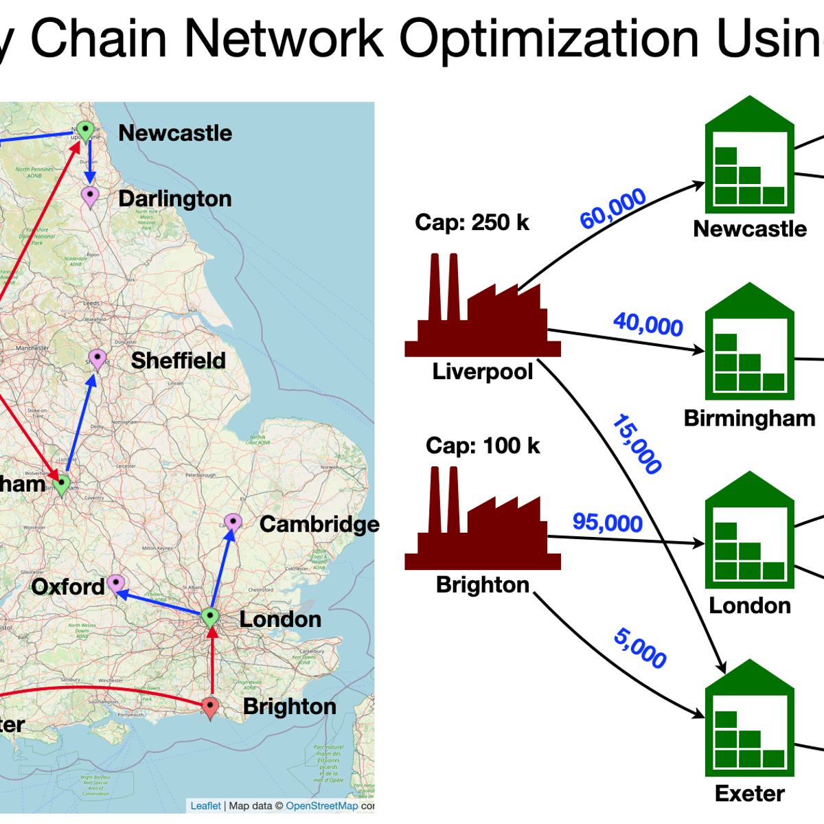
Supply Chain Network Optimization Using MILP on RStudio
Supply Chain Network Optimization
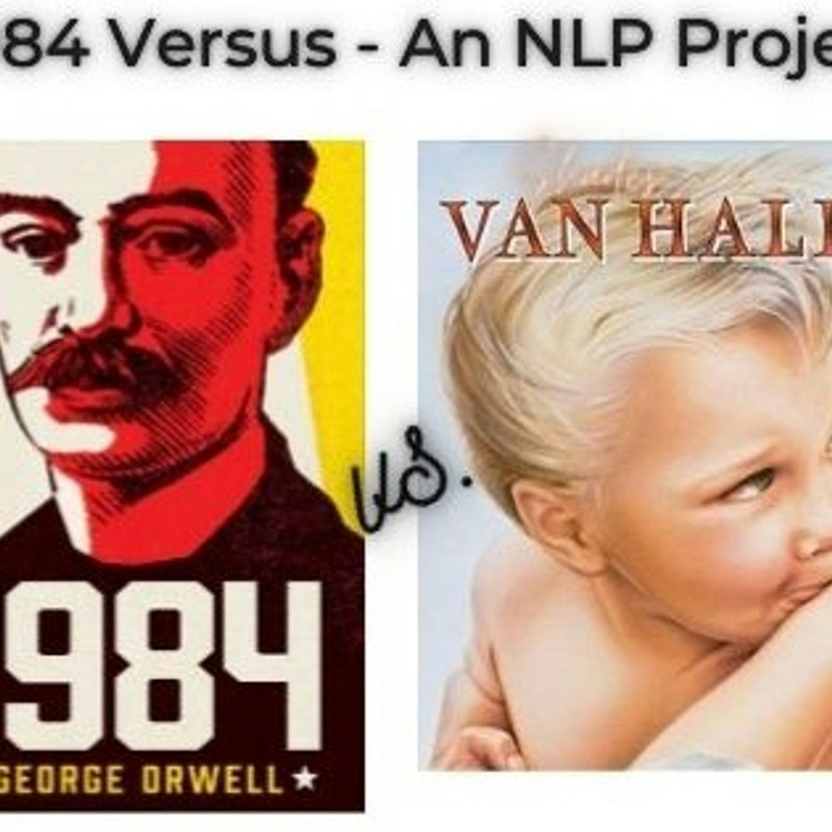
Building a unique NLP project: 1984 book vs 1984 album
Welcome to the “Building a unique NLP project: 1984 book vs 1984 album” guided project.
This project is for anyone interested in exploring fun and interactive Natural Language Processing (NLP) projects. Inspired by the cultural phenomenon, Versus, in this project we’re going to be leveraging the NLP to compare 1984, the dystopian social science fiction novel by the English novelist George Orwell and 1984, the sixth studio album by American rock band Van Halen.
In this project, we’ll explore the NLP techniques of:
1. summarizing text
2. sentiment analysis
3. word clouds.
At the end of this project, learners will be able to demonstrate a beginner's understanding of building NLP projects.
Understanding and Visualizing Data with Python
In this course, learners will be introduced to the field of statistics, including where data come from, study design, data management, and exploring and visualizing data. Learners will identify different types of data, and learn how to visualize, analyze, and interpret summaries for both univariate and multivariate data. Learners will also be introduced to the differences between probability and non-probability sampling from larger populations, the idea of how sample estimates vary, and how inferences can be made about larger populations based on probability sampling.
At the end of each week, learners will apply the statistical concepts they’ve learned using Python within the course environment. During these lab-based sessions, learners will discover the different uses of Python as a tool, including the Numpy, Pandas, Statsmodels, Matplotlib, and Seaborn libraries. Tutorial videos are provided to walk learners through the creation of visualizations and data management, all within Python. This course utilizes the Jupyter Notebook environment within Coursera.
Text Mining and Analytics
This course will cover the major techniques for mining and analyzing text data to discover interesting patterns, extract useful knowledge, and support decision making, with an emphasis on statistical approaches that can be generally applied to arbitrary text data in any natural language with no or minimum human effort.
Detailed analysis of text data requires understanding of natural language text, which is known to be a difficult task for computers. However, a number of statistical approaches have been shown to work well for the "shallow" but robust analysis of text data for pattern finding and knowledge discovery. You will learn the basic concepts, principles, and major algorithms in text mining and their potential applications.
Visualizing & Communicating Results in Python with Jupyter
Code and run your first Python program in minutes without installing anything!
This course is designed for learners with limited coding experience, providing a foundation for presenting data using visualization tools in Jupyter Notebook. This course helps learners describe and make inferences from data, and better communicate and present data.
The modules in this course will cover a wide range of visualizations which allow you to illustrate and compare the composition of the dataset, determine the distribution of the dataset, and visualize complex data such as geographically-based data. Completion of Data Analysis in Python with pandas & matplotlib in Spyder before taking this course is recommended.
To allow for a truly hands-on, self-paced learning experience, this course is video-free.
Assignments contain short explanations with images and runnable code examples with suggested edits to explore code examples further, building a deeper understanding by doing. You’ll benefit from instant feedback from a variety of assessment items along the way, gently progressing from quick understanding checks (multiple choice, fill in the blank, and un-scrambling code blocks) to small, approachable coding exercises that take minutes instead of hours. Finally, an accumulative lab at the end of the course will provide you an opportunity to apply all learned concepts within a real-world context.
Popular Internships and Jobs by Categories
Find Jobs & Internships
Browse


© 2024 BoostGrad | All rights reserved