Back to Courses


Data Science Courses - Page 80
Showing results 791-800 of 1407
Data Science in Real Life
Have you ever had the perfect data science experience? The data pull went perfectly. There were no merging errors or missing data. Hypotheses were clearly defined prior to analyses. Randomization was performed for the treatment of interest. The analytic plan was outlined prior to analysis and followed exactly. The conclusions were clear and actionable decisions were obvious. Has that every happened to you? Of course not. Data analysis in real life is messy. How does one manage a team facing real data analyses? In this one-week course, we contrast the ideal with what happens in real life. By contrasting the ideal, you will learn key concepts that will help you manage real life analyses.
This is a focused course designed to rapidly get you up to speed on doing data science in real life. Our goal was to make this as convenient as possible for you without sacrificing any essential content. We've left the technical information aside so that you can focus on managing your team and moving it forward.
After completing this course you will know how to:
1, Describe the “perfect” data science experience
2. Identify strengths and weaknesses in experimental designs
3. Describe possible pitfalls when pulling / assembling data and learn solutions for managing data pulls.
4. Challenge statistical modeling assumptions and drive feedback to data analysts
5. Describe common pitfalls in communicating data analyses
6. Get a glimpse into a day in the life of a data analysis manager.
The course will be taught at a conceptual level for active managers of data scientists and statisticians. Some key concepts being discussed include:
1. Experimental design, randomization, A/B testing
2. Causal inference, counterfactuals,
3. Strategies for managing data quality.
4. Bias and confounding
5. Contrasting machine learning versus classical statistical inference
Course promo:
https://www.youtube.com/watch?v=9BIYmw5wnBI
Course cover image by Jonathan Gross. Creative Commons BY-ND https://flic.kr/p/q1vudb
Network Analysis for Marketing Analytics
Network analysis is a long-standing methodology used to understand the relationships between words and actors in the broader networks in which they exist. This course covers network analysis as it pertains to marketing data, specifically text datasets and social networks. Learners walk through a conceptual overview of network analysis and dive into real-world datasets through instructor-led tutorials in Python. The course concludes with a major project.
This course can be taken for academic credit as part of CU Boulder’s Master of Science in Data Science (MS-DS) degree offered on the Coursera platform. The MS-DS is an interdisciplinary degree that brings together faculty from CU Boulder’s departments of Applied Mathematics, Computer Science, Information Science, and others. With performance-based admissions and no application process, the MS-DS is ideal for individuals with a broad range of undergraduate education and/or professional experience in computer science, information science, mathematics, and statistics. Learn more about the MS-DS program at https://www.coursera.org/degrees/master-of-science-data-science-boulder.
Design and Build a Data Warehouse for Business Intelligence Implementation
The capstone course, Design and Build a Data Warehouse for Business Intelligence Implementation, features a real-world case study that integrates your learning across all courses in the specialization. In response to business requirements presented in a case study, you’ll design and build a small data warehouse, create data integration workflows to refresh the warehouse, write SQL statements to support analytical and summary query requirements, and use the MicroStrategy business intelligence platform to create dashboards and visualizations.
In the first part of the capstone course, you’ll be introduced to a medium-sized firm, learning about their data warehouse and business intelligence requirements and existing data sources. You’ll first architect a warehouse schema and dimensional model for a small data warehouse. You’ll then create data integration workflows using Pentaho Data Integration to refresh your data warehouse. Next, you’ll write SQL statements for analytical query requirements and create materialized views to support summary data management. For data integration workflows and analytical queries, you can use either Oracle or PostgreSQL. Finally, you will use MicroStrategy OLAP capabilities to gain insights into your data warehouse. In the completed project, you’ll have built a small data warehouse containing a schema design, data integration workflows, analytical queries, materialized views, dashboards and visualizations that you’ll be proud to show to your current and prospective employers.
Portfolio Optimization using Markowitz Model
In this 1-hour long project-based course, you will learn how to optimize a two-asset portfolio at the optimum risk-to-return with finding the maximum Sharpe ratio. To achieve this, we will be working around the Sharpe ratios of two given assets, we will find the efficient frontier of these assets, and find where they intersect the best by utilizing the Markowitz Model.
The content of this course draws on the knowledge of Project: Compare Stock Returns with Google Sheets, so you are highly recommended to take it first if you are not familiar with how the Sharpe ratio is calculated and don’t have an understanding of how the risk-to-return metrics work.
Note: This course works best for learners who are based in the North America region. We're currently working on providing the same experience in other regions.
This course's content is not intended to be investment advice and does not constitute an offer to perform any operations in the regulated or unregulated financial market.
Analysis of Variance with ANOVA in Google Sheets
In every domain it is critical to decision making to understand whether differences exist between two or more groups of things or outcomes. In this course you will test for differences with the One-Way ANOVA analysis of variance technique. You will also learn how to design the test and apply tactics so that you are able to confidently report statistical significance between and within groups if it exists. For this course, we will work side-by-side in the free-to-use software Google Sheets.
By the end of this course, you will be able to apply ANOVA and post hoc tests using any spreadsheet software and you will be able to confidently report levels of statistical significance in groups.
Note: This course works best for learners who are based in the North America region. We’re currently working on providing the same experience in other regions.
Practical Machine Learning
One of the most common tasks performed by data scientists and data analysts are prediction and machine learning. This course will cover the basic components of building and applying prediction functions with an emphasis on practical applications. The course will provide basic grounding in concepts such as training and tests sets, overfitting, and error rates. The course will also introduce a range of model based and algorithmic machine learning methods including regression, classification trees, Naive Bayes, and random forests. The course will cover the complete process of building prediction functions including data collection, feature creation, algorithms, and evaluation.
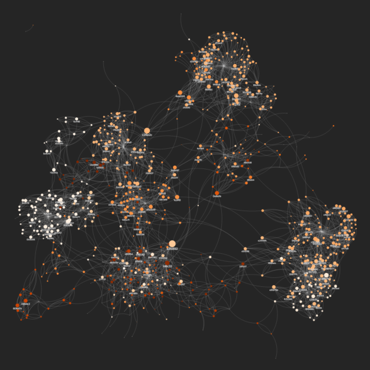
Introduction to Systems and Network Mapping with Kumu
In this 1-hour long project-based course, you will create an interactive multi-elements relationship map, as well as design visualizations for a real-world social network, based on metrics analyses.
Besides helping you to make sense of complex data, relationship maps like the ones we will build here are a great medium to visually present Causal Loop and Stock and Flow diagrams, as well as non-linear dynamics within an ecosystem.
This project will also introduce you to some of the basic concepts behind network theory, which will inform the analyses and interpretations of the maps you will create.
The art and craft of creating and communicating relationship maps is applicable to a wide range of areas, from design and software engineering, to organization consultancy and community building. And this project is an accessible opportunity for anyone to get some hands-on practice and knowledge on this subject. So let's map!
Note: This course works best for learners who are based in the North America region. We’re currently working on providing the same experience in other regions.
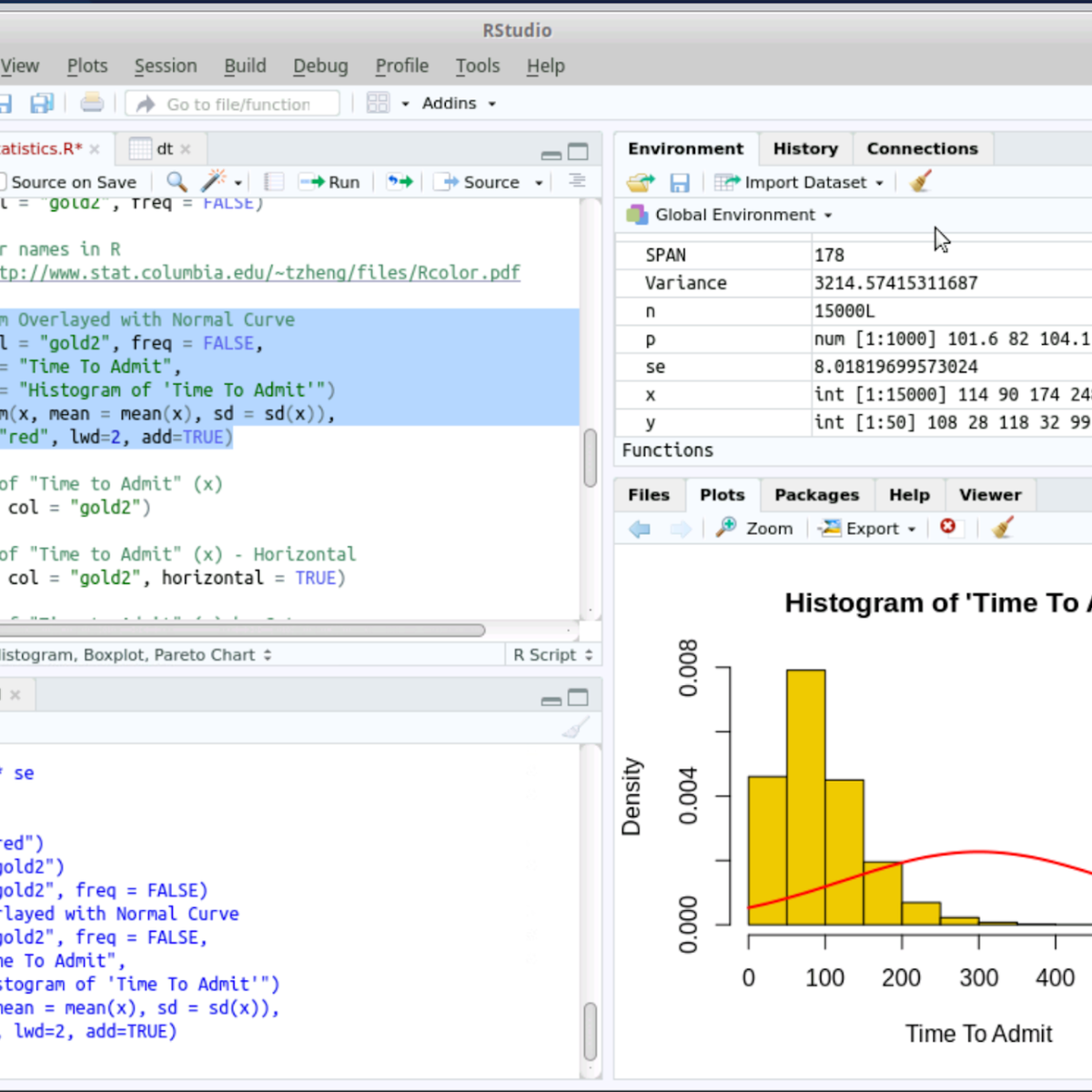
RStudio for Six Sigma - Basic Descriptive Statistics
Welcome to RStudio for Six Sigma - Basic Description Statistics. This is a project-based course which should take approximately 2 hours to finish. Before diving into the project, please take a look at the course objectives and structure.
By the end of this project, you will learn to perform Basic Descriptive Analysis (Six Sigma) tasks hands-on using RStudio. Both R language and RStudio tools are Open Source and can be used for most Six Sigma analysis tasks without needing commercial software.
Measurement Systems Analysis
In this course, you will learn to analyze measurement systems for process stability and capability and why having a stable measurement process is imperative prior to performing any statistical analysis. You will analyze continuous measurement systems and statistically characterize both accuracy and precision using R software. You will perform measurement systems analysis for potential, short-term and long-term statistical control and capability. Additionally, you will learn how to assess a discrete measurement and perform analyses for internal consistency, concordance between assessors, and concordance with a standard. Finally, you will learn how to make decisions on measurement systems process improvement.
This specialization can be taken for academic credit as part of CU Boulder’s Master of Science in Data Science (MS-DS) degree offered on the Coursera platform. The MS-DS is an interdisciplinary degree that brings together faculty from CU Boulder’s departments of Applied Mathematics, Computer Science, Information Science, and others. With performance-based admissions and no application process, the MS-DS is ideal for individuals with a broad range of undergraduate education and/or professional experience in computer science, information science, mathematics, and statistics. Learn more about the MS-DS program at https://www.coursera.org/degrees/master-of-science-data-science-boulder.
Improve Your Python Code Using Amazon CodeGuru
Learn how to use Amazon CodeGuru Reviewer to automatically identify issues and vulnerabilities to improve your code quality with our new digital course, Improve your Python Code using Amazon CodeGuru. This course is designed for Python developers who are interested in learning how to use CodeGuru Reviewer to save time and improve their code review process.
In this course, you’ll learn how to use CodeGuru Reviewer to detect issues and identify recommendations to improve the quality and security of your code. The course demonstrates how CodeGuru Reviewer finds code anomalies and explains how to understand and apply its automated suggestions.
Developed at the source, this new digital course empowers you to learn about Amazon CodeGuru from the experts at AWS whenever, wherever you want. Advance your skills and knowledge to build your future in the AWS Cloud. Enroll today!
Note: There are two versions of this course: "Improve Your Java Code Using Amazon CodeGuru" for Java developers and "Improve Your Python Code Using Amazon CodeGuru" for Python developers. The courses do for a large part, overlap and in general, we recommend that you take the course that focuses on the SDK you plan to use to develop your AWS Cloud based applications.
Popular Internships and Jobs by Categories
Find Jobs & Internships
Browse


© 2024 BoostGrad | All rights reserved