
Back to Courses


Data Science Courses - Page 111
Showing results 1101-1110 of 1407
Get Familiar with ML basics in a Kaggle Competition
In this 1-hour long project, you will be able to understand how to predict which passengers survived the Titanic shipwreck and make your first submission in an Machine Learning competition inside the Kaggle platform. Also, you as a beginner in Machine Learning applications, will get familiar and get a deep understanding of how to start a model prediction using basic supervised Machine Learning models. We will choose classifiers to learn, predict, and make an Exploratory Data Analysis (also called EDA). At the end, you will know how to measure a model performance, and submit your model to the competition and get a score from Kaggle.
This guided project is for beginners in Data Science who want to do a practical application using Machine Learning. You will get familiar with the methods used in machine learning applications and data analysis.
In order to be successful in this project, you should have an account on the Kaggle platform (no cost is necessary). Be familiar with some basic Python programming, we will use numpy and pandas libraries. Some background in Statistics is appreciated, like as knowledge in probability, but it’s not a requirement.
Finding bibliography metrics using the Crossref API
Manually searching specific metadata for an academic paper is laborious. Is there any magic that we can get all metadata for the bibliography search done at once? Crossref is the tool for you. It can extract the metadata for tens of thousands of papers online in one run.
By the end of this project, learners will be able to create their own tailored R function to find paper metrics from the Crossref API. The function, which will be guided to build step by step, can easily be re-used when there are newly added articles or if the learners want to get the most up-to-date metrics. In this guided project, the instructor will walk learners through understanding the Crossref API, tailoring an R function, and wrangling the bibliography dataset. A good handle of this method will make it convenient for learners to analyze different metrics for bibliography from different fields, such as impact and number of collaborators.
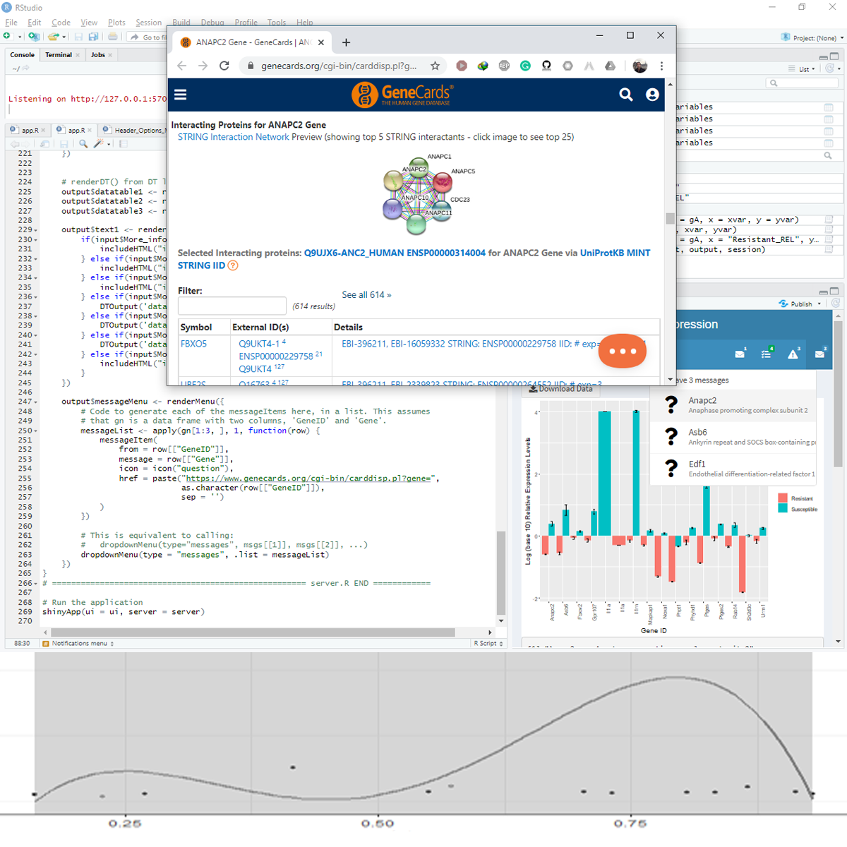
Using Shiny to Plot Differential Gene Expression
In this project-based course, you will create a Shiny app to plot gene expression data (Real-Time PCR) from a published manuscript. You will build the Shiny app from scratch and handle every component of Shiny. The project covers data processing and collecting feedback from the user to build and finetune the output.
In this course, we will be concerned with the optimal use of inputs and outputs. Instead of building a lot of inputs and outputs, we will use a limited number of components and recycle some even seven times for different purposes.
Draw Insights with Crosstabs Reports in Google Sheets
Crosstabs reports present select slices of data in a matrix format making it easier to visualize patterns and explore similarities and differences between categories or variables. In this course, we’ll explore the pivot-table tactics applied in Google Sheets to create crosstabs reports, conduct a preliminary—exploratory—analysis of the data within the report, and learn how visually presenting data in a crosstabs report can aid the user in their discovery of insights that tell the data’s story. By the end of this course, you will be able to apply pivot table tactics to create crosstabs reports and share data in your business’s domain.
Note: This course works best for learners who are based in the North America region. We’re currently working on providing the same experience in other regions.
Create Interactive Graphs in Tableau
Tableau is widely recognized as one of the premier data visualization software programs. For many years access to the program was limited to those who purchased licenses. Recently, Tableau launched a public version that grants the ability to create amazing data visualizations for free. Account members can also share and join projects to collaborate on projects that can change the world.
In this project, we will learn how to create an account, create an Interactive Graph in Tableau and share it with others.
Learning to use this in-demand tool has applications in Marketing, Finance, Operations, Sales, and many other business functions.
Note: This course works best for learners who are based in the North America region. We’re currently working on providing the same experience in other regions.
Optimize ML Models and Deploy Human-in-the-Loop Pipelines
In the third course of the Practical Data Science Specialization, you will learn a series of performance-improvement and cost-reduction techniques to automatically tune model accuracy, compare prediction performance, and generate new training data with human intelligence. After tuning your text classifier using Amazon SageMaker Hyper-parameter Tuning (HPT), you will deploy two model candidates into an A/B test to compare their real-time prediction performance and automatically scale the winning model using Amazon SageMaker Hosting. Lastly, you will set up a human-in-the-loop pipeline to fix misclassified predictions and generate new training data using Amazon Augmented AI and Amazon SageMaker Ground Truth.
Practical data science is geared towards handling massive datasets that do not fit in your local hardware and could originate from multiple sources. One of the biggest benefits of developing and running data science projects in the cloud is the agility and elasticity that the cloud offers to scale up and out at a minimum cost.
The Practical Data Science Specialization helps you develop the practical skills to effectively deploy your data science projects and overcome challenges at each step of the ML workflow using Amazon SageMaker. This Specialization is designed for data-focused developers, scientists, and analysts familiar with the Python and SQL programming languages and want to learn how to build, train, and deploy scalable, end-to-end ML pipelines - both automated and human-in-the-loop - in the AWS cloud.
Build a Project Tracking App with AppSheet
This is a Google Cloud Self-Paced Lab.
In this lab, you'll build a simple project tracking and approval application. AppSheet is a no-code development platform that lets anyone without coding experience build mobile and web applications. You can build AppSheet apps from data sources, such as Google Sheets, Excel, Cloud SQL, Salesforce, and other similar connectors. App user activity syncs to the connected data source(s).
Introduction to Statistical Analysis: Hypothesis Testing
This introductory course is for SAS software users who perform statistical analyses using SAS/STAT software. The focus is on t tests, ANOVA, and linear regression, and includes a brief introduction to logistic regression.
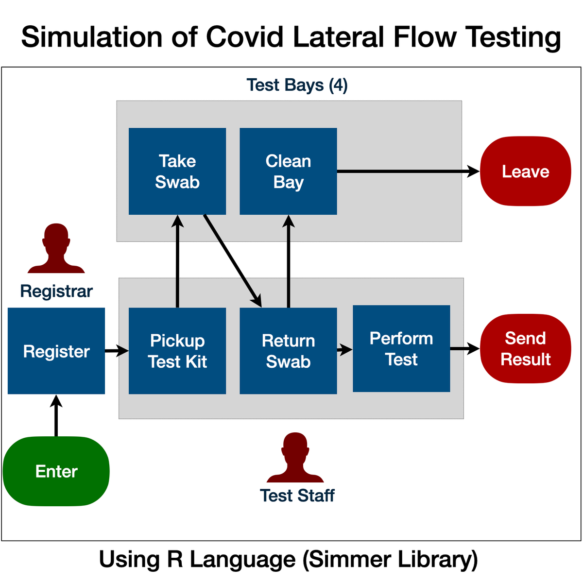
Simulation of Covid-19 Testing Process Using R Simmer
Welcome to "Simulation of Covid-19 Testing Process Using R Simmer". This is a project-based course which should take under 2 hours to finish. Before diving into the project, please take a look at the course objectives and structure.
By the end of this project, learn gain introductiory knowledge of Discrete Event Simulation, use R Studio and Simmer library, create statistical variables required for simulation, define process trajectory, define and assign resources, define arrivals (eg. incoming customers / work units), run simulation in R, store results in data frames, plot charts and interpret the results.
Create Relational Database Tables Using SQLiteStudio
In this project-based course, you will learn how to use the SQLiteStudio database management system to create a relational database, add tables to the database, and populate the tables.
Data is at the heart of all computing practices and plays an important role in our business and personal lives. Data is manipulated by programs, displayed on web browsers, transferred from location to location by networking systems, and used for business and personal decision making. Organizing, storing and safeguarding data in a database is the main purpose of database management software. Since data is such a large part of your life--whether used for your mobile phone address list or your medical record at your doctor’s office--wouldn’t it be great to know a little more about how a database works? By the end of this project, you will have a new appreciation for the importance of data and how it’s organized in a database.
Note: This course works best for learners who are based in the North America region. We’re currently working on providing the same experience in other regions.
Popular Internships and Jobs by Categories
Browse
© 2024 BoostGrad | All rights reserved