Back to Courses




Business Essentials Courses - Page 40
Showing results 391-400 of 645

Create Online Employee Onboarding Course with Eduflow
This course will walk you through how to create an online employee onboarding course. By the end of this project, you will create an Eduflow course to assist in your employee onboarding process. Eduflow is a free, easy-to-use online course builder that allows you to build an interactive learning experience for your team. In this project, you will open an Eduflow account and begin creating an interactive employee onboarding course. You will then learn how to mix and match different learning activities including content, submissions, and videos. Furthermore, you will learn how to invite employees to the course, keep track of their progress, and gain valuable insight and feedback from your learners. The onboarding process is extremely important in developing your company brand and culture. Using Eduflow allows you to create an innovative, customized, and engaging onboarding experience for your employees.
Note: This course works best for learners who are based in the North America region. We’re currently working on providing the same experience in other regions.

Excel for Beginners: Advanced Functions
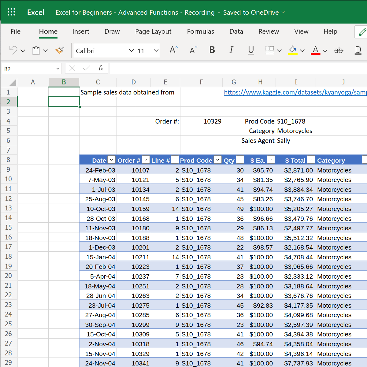
This 1-hour, project-based course introduces learners to more-advanced spreadsheet functions. We’ll be using Excel on the Web in this project, which is the free spreadsheet program offered by Microsoft. However, all of the concepts that you will learn in this project will be applicable to other spreadsheet programs, such as LibreOffice Calc and Google Sheets.
We will cover the following concepts in a hands-on manner:
- Advanced conditional functions: countif, sumif, averageif
- Easy searching and matching of data with reference functions: vlookup, xlookup, index & match
Please Note: If you don't have a free Microsoft account, you will need to create one to be able to complete the content.

How to increase engagement to Instagram Business profile
In this 1-hour long project-based course, you will learn how to build a business profile on Instagram and increase the engagement of your followers, engage with story strategies, people, target market and buyers.
By the end of this project, you will have learned how to develop a strong business profile on Instagram and increase the market engagement.

Inclusive Analytic Techniques
Many policies, products, services or processes that we think of as gender-neutral actually have gendered outcomes. Everything from snow plowing to car safety to investment advising to infrastructure investment has impacts that differ by gender. These outcomes can be even more biased if we look at important intersections with race, indigeneity, differences in ability, ethnicity, sexual orientation, and other identities. The question is, what can you do to change this? And, how can you avoid the risks of bias or create innovative new offerings using gender-based insights?
Inclusive Analytics Techniques will provide you with the tools and analytical techniques to uncover these intersectional insights. The course covers both quantitative and qualitative data collection and analysis, including basic statistical techniques and practical instructions for working with customers, beneficiaries and other stakeholders. You will learn to incorporate multiple sources of rich evidence in order to develop innovative insights into how policies, products, services and processes can be made more equitable or serve unique communities.
This is the second course of the Gender Analytics Specialization offered by the Institute for Gender and the Economy (GATE) at the University of Toronto's Rotman School of Management. It's great on its own, and you will get even more out of it if you take it as part of the Specialization.

Get Started with Airtable
Airtable is a platform that you can use to streamline your processes, workflow, and projects. With Airtable, you have a database at your fingertips that allows you to customize for your needs. Integrations help to manage whatever you need to work on. Once you have developed your information in Airtable, you have options for viewing and sharing. You can keep your team and stakeholders up to date on the status of projects. The way that you present material can be changed based on your audience. Your team can view material in a Kanban or Gantt chart. Your stakeholders can use apps to create real-time charts and summaries. In this project, you will set up your Airtable account and create a project to track.

Doing more with Google Sheets
Google Sheets is a robust, cloud-based application that empowers you to create sophisticated spreadsheets. Whether you are working at your desk—or from your smartphone or tablet on-the-go—Google Sheets helps you organize, analyze, and share your most important data. In this course for Sheets users, you’ll learn how to make your own supercharged spreadsheets, incorporating powerful functions and visualizations to accelerate your data analysis and share meaningful insights with your team. Follow along with exercises and a companion spreadsheet to practice new skills as you encounter them.
About the Instructor
Malia is a tech professional based in Los Angeles who uses Google Workspace and Google Sheets everyday to manage projects, collaborate with remote teams, and make data-driven decisions.

How to use Pathfinder commands in Adobe Illustrator
During this project, you’ll use the Pathfinder panel tools in Adobe Illustrator to cut and combine vector shapes. For practice, you’ll build a vector image of a planet with rings, sliced text, along with decorative designs made from basic objects. By the end of this project, you’ll be comfortable manipulating, cutting, and combining vector objects in Adobe Illustrator.

Data Visualization in Excel
In an age now driven by "big data", we need to cut through the noise and present key information in a way that can be quickly consumed and acted upon making data visualization an increasingly important skill. Visualizations need to not only present data in an easy to understand and attractive way, but they must also provide context for the data, tell a story, achieving that fine balance between form and function. Excel has many rivals in this space, but it is still an excellent choice, particularly if it's where your data resides. It offers a wealth of tools for creating visualizations other than charts and the chart options available are constantly increasing and improving, so the newer versions now include waterfall charts, sunburst diagrams and even map charts. But what sets Excel apart is its flexibility, it gives us total creative control over our designs so if needed we could produce our own animated custom chart to tell the right story for our data.
Over five weeks we will explore Excel's rich selection of visualization tools using practical case studies as seen through the eyes of Rohan, an environmental analyst. Rohan is required to produce visualizations that will show trends, forecasts, breakdowns and comparisons for a large variety of environmental data sets. As well as utilising the usual chart types he wants to use conditional formats, sparklines, specialised charts and even create his own animated charts and infographics. In some cases, he will also need to prepare the data using pivot tables to drill down and answer very specific questions. We are going to help him achieve all this and present our finished visualizations in attractive reports and dashboards that use tools like slicers and macros for automation and interactivity.
These are the topics we will cover:
Week 1: Dynamic visualizations with conditional formatting, custom number formatting, sparklines and macros
Week 2: Charting techniques for telling the right story
Week 3: Creating specialised and custom charts
Week 4: Summarising and filtering data with pivot tables and pivot charts
Week 5: Creating interactive dashboards in Excel
This is the second course in our Specialization on Data Analytics and Visualization. The first course: Excel Fundamentals for Data Analysis, covers data preparation and cleaning but also teaches some of the prerequisites for this course like tables and named ranges as well as text, lookup and logical functions. To get the most out of this course we would recommend you do the first course or have experience with these topics. In this course we focus on Data Visualization in Excel, join us for this exciting journey.
Financial Statement and Ratio Analysis for Accountants
The objective of Financial Statement and Ratio Analysis for MBAs is to provide you with the knowledge and skills necessary to analyze, interpret, understand, and use financial information to make informed decisions. We will discuss financial reporting from a user’s perspective, use a variety of tools to break apart financial reports into meaningful units for analysis, forecast financial statements, and value a firm. This course is intended to give you exposure to the issues facing users of financial statements. You will better understand your role in the financial reporting process if you know how the financial statements will ultimately be used.
Financial Statement and Ratio Analysis for MBAs will require you to think critically about issues for which there can be more than one “correct” answer. Hence, your analysis and conclusions must be based on sound assumptions and well-constructed analysis and arguments.

Data Analytics for Lean Six Sigma
Welcome to this course on Data Analytics for Lean Six Sigma.
In this course you will learn data analytics techniques that are typically useful within Lean Six Sigma improvement projects. At the end of this course you are able to analyse and interpret data gathered within such a project. You will be able to use Minitab to analyse the data. I will also briefly explain what Lean Six Sigma is.
I will emphasize on use of data analytics tools and the interpretation of the outcome. I will use many different examples from actual Lean Six Sigma projects to illustrate all tools. I will not discuss any mathematical background.
The setting we chose for our data example is a Lean Six Sigma improvement project. However data analytics tools are very widely applicable. So you will find that you will learn techniques that you can use in a broader setting apart from improvement projects.
I hope that you enjoy this course and good luck!
Dr. Inez Zwetsloot & the IBIS UvA team
Popular Internships and Jobs by Categories
Find Jobs & Internships
Browse
© 2024 BoostGrad | All rights reserved