Back to Courses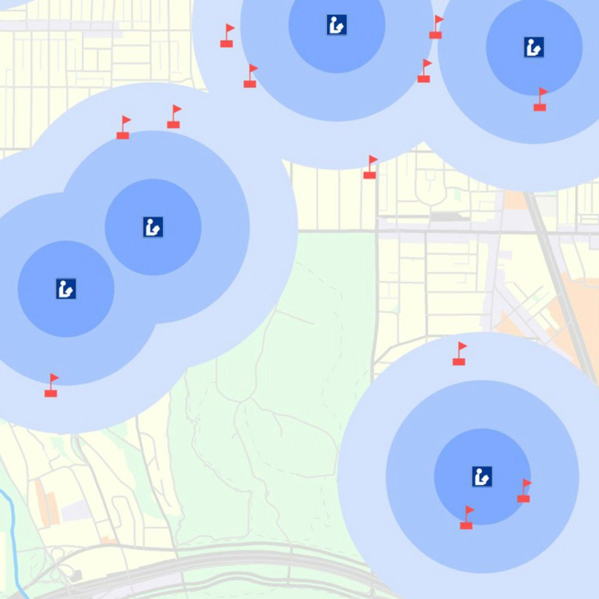





Data Analysis Courses - Page 80
Showing results 791-800 of 998

Introduction to GIS Mapping
Get started learning about the fascinating and useful world of geographic information systems (GIS)! In this first course of the specialization GIS, Mapping, and Spatial Analysis, you'll learn about what a GIS is, how to get started with the software yourself, how things we find in the real world can be represented on a map, how we record locations using coordinates, and how we can make a two-dimensional map from a three-dimensional Earth. In the course project, you will create your own GIS data by tracing geographic features from a satellite image for a location and theme of your choice. This course will give you a strong foundation in mapping and GIS that will give you the understanding you need to start working with GIS, and to succeed in the other courses in this specialization.
This course is for anyone who wants to learn about mapping and GIS. You don't have to have any previous experience - just your curiosity! The course includes both practical software training and explanations of the concepts you need to know to make informed decisions as you start your journey to becoming a GIS analyst.
You will need a Windows computer with ArcGIS Desktop installed. (software is not provided)

Scripting with Python and SQL for Data Engineering
In this third course of the Python, Bash and SQL Essentials for Data Engineering Specialization, you will explore techniques to work effectively with Python and SQL. We will go through useful data structures in Python scripting and connect to databases like MySQL. Additionally, you will learn how to use a modern text editor to connect and run SQL queries against a real database, performing operations to load and extract data. Finally, you will use extracted data from websites using scraping techniques. These skills will allow you to work effectively when data is not readily available, or when spatial queries are required to extract useful information from databases.

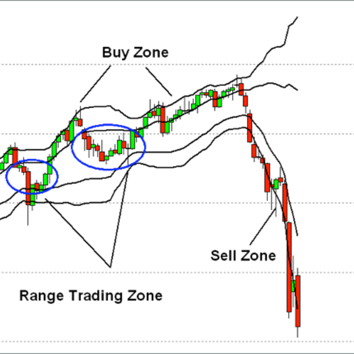
Create Technical Stock Charts Using R and Quantmod
In this 1-hour long project-based course, you will learn how to pull down Stock Data using the R quantmod Package and Yahoo Finance API. You will also learn how to apply Technical Indicators to the data and draw graphs based on those Indicators.
Note: This course works best for learners who are based in the North America region. We’re currently working on providing the same experience in other regions.

Study Designs in Epidemiology
Choosing an appropriate study design is a critical decision that can largely determine whether your study will successfully answer your research question. A quick look at the contents page of a biomedical journal or even at the health news section of a news website is enough to tell you that there are many different ways to conduct epidemiological research.
In this course, you will learn about the main epidemiological study designs, including cross-sectional and ecological studies, case-control and cohort studies, as well as the more complex nested case-control and case-cohort designs. The final module is dedicated to randomised controlled trials, which is often considered the optimal study design, especially in clinical research. You will also develop the skills to identify strengths and limitations of the various study designs. By the end of this course, you will be able to choose the most suitable study design considering the research question, the available time, and resources.

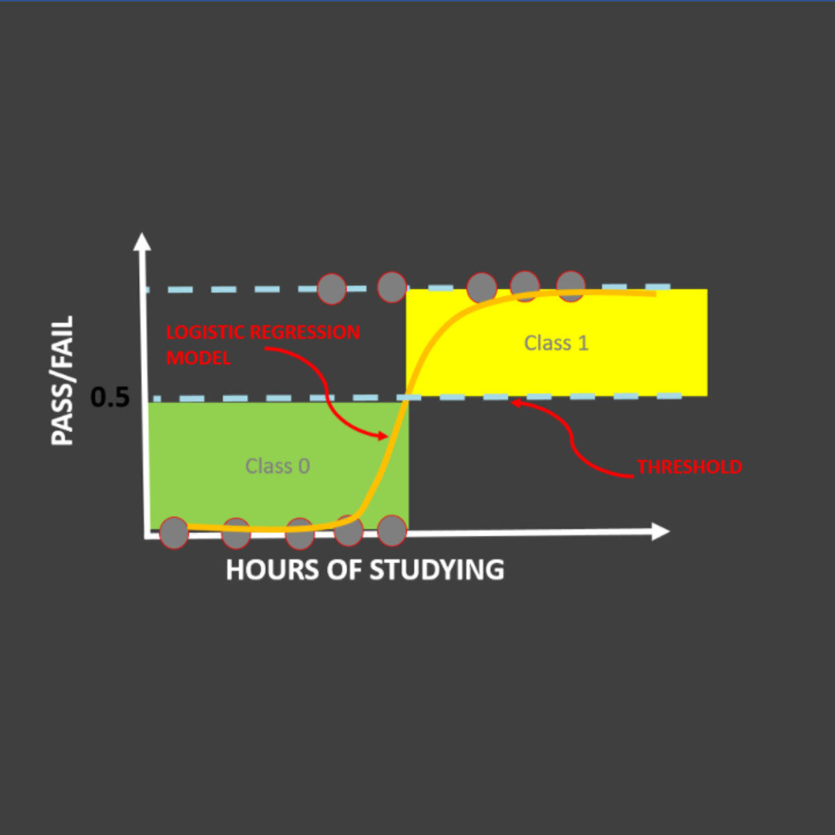
Logistic Regression 101: US Household Income Classification
In this hands-on project, we will train Logistic Regression and XG-Boost models to predict whether a particular person earns less than 50,000 US Dollars or more than 50,000 US Dollars annually. This data was obtained from U.S. Census database and consists of features like occupation, age, native country, capital gain, education, and work class.
By the end of this project, you will be able to:
- Understand the theory and intuition behind Logistic Regression and XG-Boost models
- Import key Python libraries, dataset, and perform Exploratory Data Analysis like removing missing values, replacing characters, etc.
- Perform data visualization using Seaborn.
- Prepare the data to increase the predictive power of Machine Learning models by One-Hot Encoding, Label Encoding, and Train/Test Split
- Build and train Logistic Regression and XG-Boost models to classify the Income Bracket of U.S. Household.
- Assess the performance of trained model and ensure its generalization using various KPIs such as accuracy, precision and recall.
Note: This course works best for learners who are based in the North America region. We’re currently working on providing the same experience in other regions.

Data Visualization with Python
One of the most important skills of successful data scientists and data analysts is the ability to tell a compelling story by visualizing data and findings in an approachable and stimulating way. In this course you will learn many ways to effectively visualize both small and large-scale data. You will be able to take data that at first glance has little meaning and present that data in a form that conveys insights.
This course will teach you to work with many Data Visualization tools and techniques. You will learn to create various types of basic and advanced graphs and charts like: Waffle Charts, Area Plots, Histograms, Bar Charts, Pie Charts, Scatter Plots, Word Clouds, Choropleth Maps, and many more! You will also create interactive dashboards that allow even those without any Data Science experience to better understand data, and make more effective and informed decisions.
You will learn hands-on by completing numerous labs and a final project to practice and apply the many aspects and techniques of Data Visualization using Jupyter Notebooks and a Cloud-based IDE. You will use several data visualization libraries in Python, including Matplotlib, Seaborn, Folium, Plotly & Dash.

Getting Started with Kaggle
In this guided project, you will explore Kaggle Competitions, Kaggle Datasets, Kaggle Notebooks which is a cloud-based coding environment, Kaggle Discussion forum and Kaggle Courses.
We will begin this course by creating a Kaggle account. We will then explore Kaggle competitions, the prize money and how to participate in them. We will focus primarily on the legendary Titanic Machine learning competition. We will explore Kaggle datasets. We will also explore Kaggle Notebooks which is a cloud-based coding environment. We will also explore the awesome “Copy and Edit” feature from Kaggle notebooks that enables us to work on and improvise on the work of others. In the final tasks, we will explore the Kaggle community discussion forum and explore the theoretical and practical sections of Kaggle courses.
By the end of this project, you will be confident in using Kaggle for your data science and machine learning needs.

Introduction to Line Balancing Using Precedence Diagram
In this 1-hour 30-minutes long project-based course, you will learn how to o define what is meant by cycle time and how to calculate it, draw a precedence diagram for your given process and calculate the idle time for this process, you will be able to calculate the efficiency of the system and the minimum number of workstations and how to assign tasks to these workstations, by applying all of these you will create a complete line balancing system.
Note: This course works best for learners who are based in the North America region. We’re currently working on providing the same experience in other regions.

Inferential Statistics
This course covers commonly used statistical inference methods for numerical and categorical data. You will learn how to set up and perform hypothesis tests, interpret p-values, and report the results of your analysis in a way that is interpretable for clients or the public. Using numerous data examples, you will learn to report estimates of quantities in a way that expresses the uncertainty of the quantity of interest. You will be guided through installing and using R and RStudio (free statistical software), and will use this software for lab exercises and a final project. The course introduces practical tools for performing data analysis and explores the fundamental concepts necessary to interpret and report results for both categorical and numerical data

Basic Data Descriptors, Statistical Distributions, and Application to Business Decisions
The ability to understand and apply Business Statistics is becoming increasingly important in the industry. A good understanding of Business Statistics is a requirement to make correct and relevant interpretations of data. Lack of knowledge could lead to erroneous decisions which could potentially have negative consequences for a firm. This course is designed to introduce you to Business Statistics. We begin with the notion of descriptive statistics, which is summarizing data using a few numbers. Different categories of descriptive measures are introduced and discussed along with the Excel functions to calculate them. The notion of probability or uncertainty is introduced along with the concept of a sample and population data using relevant business examples. This leads us to various statistical distributions along with their Excel functions which are then used to model or approximate business processes. You get to apply these descriptive measures of data and various statistical distributions using easy-to-follow Excel based examples which are demonstrated throughout the course.
To successfully complete course assignments, students must have access to Microsoft Excel.
________________________________________
WEEK 1
Module 1: Basic Data Descriptors
In this module you will get to understand, calculate and interpret various descriptive or summary measures of data. These descriptive measures summarize and present data using a few numbers. Appropriate Excel functions to do these calculations are introduced and demonstrated.
Topics covered include:
• Categories of descriptive data
• Measures of central tendency, the mean, median, mode, and their interpretations and calculations
• Measures of spread-in-data, the range, interquartile-range, standard deviation and variance
• Box plots
• Interpreting the standard deviation measure using the rule-of-thumb and Chebyshev’s theorem
________________________________________
WEEK 2
Module 2: Descriptive Measures of Association, Probability, and Statistical Distributions
This module presents the covariance and correlation measures and their respective Excel functions. You get to understand the notion of causation versus correlation. The module then introduces the notion of probability and random variables and starts introducing statistical distributions.
Topics covered include:
• Measures of association, the covariance and correlation measures; causation versus correlation
• Probability and random variables; discrete versus continuous data
• Introduction to statistical distributions
________________________________________
WEEK 3
Module 3: The Normal Distribution
This module introduces the Normal distribution and the Excel function to calculate probabilities and various outcomes from the distribution.
Topics covered include:
• Probability density function and area under the curve as a measure of probability
• The Normal distribution (bell curve), NORM.DIST, NORM.INV functions in Excel
________________________________________
WEEK 4
Module 4: Working with Distributions, Normal, Binomial, Poisson
In this module, you'll see various applications of the Normal distribution. You will also get introduced to the Binomial and Poisson distributions. The Central Limit Theorem is introduced and explained in the context of understanding sample data versus population data and the link between the two.
Topics covered include:
• Various applications of the Normal distribution
• The Binomial and Poisson distributions
• Sample versus population data; the Central Limit Theorem
Popular Internships and Jobs by Categories
Browse
© 2024 BoostGrad | All rights reserved


