Back to Courses
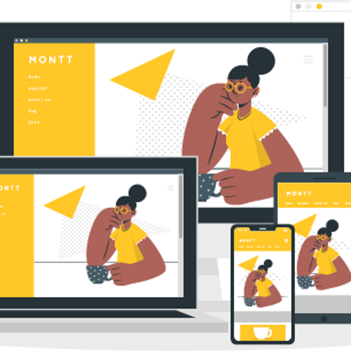
Developing Responsive Web Pages Using HTML5 and CSS3
Overview
The number of mobile users has increased exponentially over the past few years. Shopping, social connect, entertainment and other activities are just a few clicks away for these mobile users. A responsive web design adjusts the layout and appearance of the web pages to suit the resolution and width of the screens. This makes a web page look attractive on devices with diverse screen sizes. Designing a well-organized, responsive, and user-friendly web page has therefore become the need of the hour. This course will guide you to develop websites that adapt to the device size of the visitor’s viewport and provide users an optimal experience.
Your dream job is just a tap away — only on the BoostGrad app.

View on Boostgrad App
View on Browser
Continue
Download the app