Create Charts and Dashboard using Google Sheets
Overview
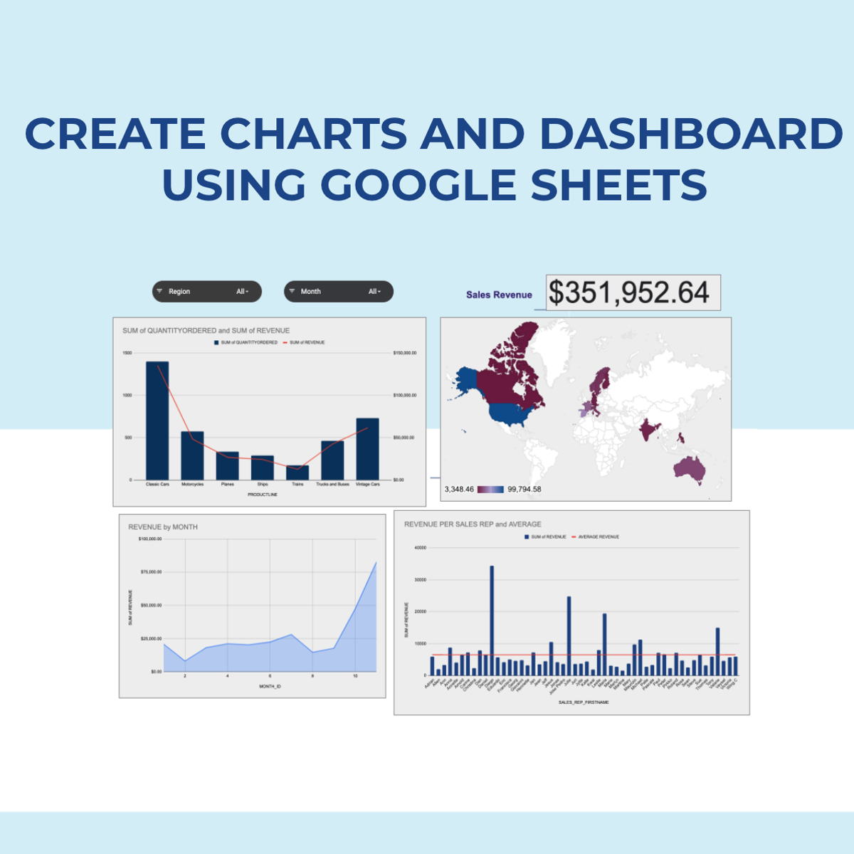
In this 2-hour long project-based course, you will learn how to create effective charts and a dynamic dashboard to visualize data sets. You will be able to work with vlookups, pivot tables and basic formulas and be able to create dynamic charts, sparklines, and a robust, dynamic dashboard to present the data. By the end of the project you will be able to: - Understand the terminologies of spreadsheets - Work with basic formulas in Google Sheets - Create 8 Basic Charts for visualizing data - Generate Dynamic Charts from a dropdown list - Generate Sparklines to represent data - Build a dashboard and introduce Basic and Advanced Charts - Use Slicers to filter data and create a robust and dynamic dashboard Note: If you don't have a Google account, you will need to create one to be able to complete the content.

Download the app